via bookforum...
Scribblers of America, Unite! Are women writers undervalued because of what they write or how we read?
By Katha Pollitt
Posted Monday, March 9, 2009, at 6:48 AM ET
A Jury of Her Peers.Elaine Showalter's A Literature of Their Own: British Women Novelists From Bronte to Lessing (1977) changed the way we read fiction by women by showing female writers in historical, political, and literary relation to one another, and doing it in prose that was energetic, enjoyable, and blessedly free of academic jargon. At the time, this was a controversial project. The previous year, Ellen Moers' brilliant (and, sadly, out of print) Literary Women was attacked by Anne Tyler for arguing that great women writers like Dickinson, Collette, and Woolf shared something like a literary tradition with lesser writers like Elizabeth Barrett Browning and Fanny Fern. You can see why Tyler bridled: After all, it was the misogynists who usually grouped women writers together, the better to dismiss them all—Nathaniel Hawthorne's "damned mob of scribbling women," churning out their hypersensitive derivative poems, their narrow, pedestrian domestic fiction. Women writers, the good ones, anyway, tended not to want to be put on the bookshelf next to the other women writers. More...
Thursday, April 23, 2009
Wednesday, March 25, 2009
Local color
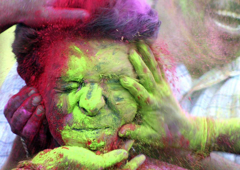
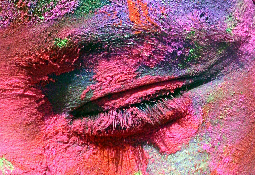
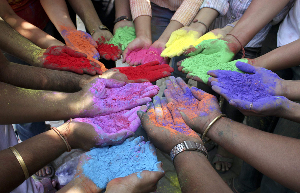
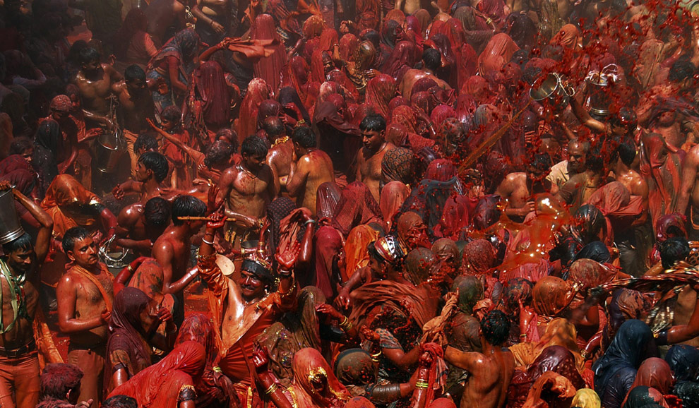
Holi - the Festival of Colors - The Big Picture - Boston.com
This is an amazing series of images well worth a look at the Big Picture...
Also see the Story of Prahlada


Holi - the Festival of Colors - The Big Picture - Boston.com
Posted using ShareThis
This is an amazing series of images well worth a look at the Big Picture...
Also see the Story of Prahlada


Holi - the Festival of Colors - The Big Picture - Boston.com
Posted using ShareThis
Another cool one by Melanie Flood


The Current State of the Art Market Q&A with Melanie Flood of Melanie Flood Projects1. Please explain to us about Melanie Flood Projects…How did it start it? Why in your house?
I began Melanie Flood Projects over the summer of 2008 because I felt that artists and photographers (like myself) needed a new style of venue to showcase their art. I was tired of it being utterly impossible for a young, talented artist to display their work, other than online or in crowded group shows that require a participation fee.
The Idea came to me when I was in the position of Managing Editor at Zingmagazine. We were involved in Art Chicago 2002 and while visiting I came across stay at home mothers that ran public galleries from their homes. These women were artists, curators, collectors, and they didn’t allow motherhood prevent them from being involved with what they loved. I was influenced most by a young woman who had Amy Sillman watercolors displayed on her fridge with magnets. Made me think differently about he way art should and could be displayed.
So based on the inspiration from these women, I decided to base the gallery from my home and I am fortunate enough to live in a lovely brownstone in a great part of Brooklyn. I am also drawn to the idea of the home as a social hub apart from public spaces such as bars, clubs, galleries, & cafes.
2. In my opinion you are pioneering the new concept of private dealing @ home…Is there a reason why?
I believe that in the environment of a gallery or museum the real importance of the artist is lost in the pressures of the “gallery” experience. By removing that factor I believe I am placing all the emphasis on the artist, using the comfortable and welcoming environment of a living space to ease viewers. I hope that in inviting people to view art in these circumstances, where art eventually ends up, will remove the formal pressures of the “art world” and will help people focus on art in it’s most natural state or form.
3. What is the advantage of it? Disadvantages? Please explain in detail.
I am not affected by the immense overhead of having a gallery space. Because I don’t have to worry about rent, making money is not at the forefront of my mind, this frees up the types of art I show. I also get to display art in my most favorite way-among domestic life, my own personal decorations. It’s like a revolving art collection! Another advantage is being able to have many styles of events other than showing art on walls. One example was a party in December where I invited 17 artists to come over for one evening and sell their wares; books, mags, zines, prints, etc…
More via Melanie Flood Projects...
Labels:
Amy Sillman,
Art,
Art world,
Artist,
Brooklyn,
Collection,
Galleries,
Visual Arts
Monday, March 23, 2009
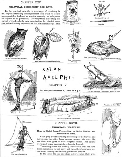
Another take is by Salon Adelphi
text from the flickr invite:
salon adelphi v by antlered.
super secret special rad art salon dec. 6 shhhhh…..
salon adelphi v
saturday december 6, 2008 @ 8 p.m.
art / film / music / readings / installation
317 adelphi / brooklyn n.y.
Art Parties
This is such a cool idea. My first thought was "Rirkrit Tiravanija - Thai artist who cooks meals as installation art". Although I think that artists have always been interested in food. They have historically bartered food for artwork and often are keen gardeners and cooks. Cooking is creative and artists are usually on a budget. Frank Fedele has written about artists and food in The Artists' Palate: Cooking with the World's Great Artists. Here is an excerpt. Evidentally the YBA's are good cooks too...Ok, but back to the art parties. Locally there is Jamie's Area in Toronto's Kensington Market (more...) but I really like this one (via flavorwire) in the Bronx called the Bronx Blue Bedroom Project started by Blanka Amezkua especially because Blanka asks artists to offer a workshop in the local community or cook a dinner for guests...Another take is by Salon Adelphi also in NYC


Labels:
Arts,
Canada,
Directories,
Globe,
Globe and Mail,
Journalism,
Newspaper,
The Bronx
Monday, March 09, 2009
More visualizations
Via flavorpill via bluprnt_van's flickr
These are so cool and so beautiful.

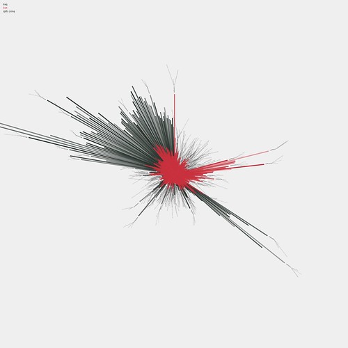
This is a visualization of the frequency of the words 'iran' and 'iraq' in New York Times articles since 1981.
This visualization reads like a clock. You can see the Iran Contra Affair at about 2:30. The first gulf war is at about 4pm. The second Iraq invasion is the biggest spike starting at about 9:30, continuing up until the current day (midnight).
Interestingy, Iran (in red) shows a large increase in activity in the months leading up to the end of 2008.
Built in Processing (http://www.processing.org)

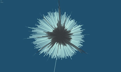
This is a visualization of the frequency of the words 'hope' and 'crisis' in the New York Times, between 1981 and 2009.
The visualization reads like a clock, where 12pm is 1981 and 12 midnight is January 1, 2009.
Interestingly, the word 'crisis' has surpassed 'hope' on only a handful of occasions. Most cleary, in August of 1990 in April of 1999, and most clearly and substantially - right now.These visualizations show the top organizations and personalities for every year from 1985 to 2001. Connections between these people & organizations are indicated by lines.

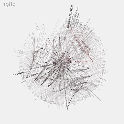
These visualizations show the top organizations and personalities for every year from 1985 to 2001. Connections between these people & organizations are indicated by lines.Data is from the newly-released NYTimes Article Search API: developer.nytimes.com
For more information, and source code to access the NYTimes API, visit
Archival-quality giclée prints of individual years are available at link
Built with Processing v1.0 - www.processing.org
These are so cool and so beautiful.

This is a visualization of the frequency of the words 'iran' and 'iraq' in New York Times articles since 1981.
This visualization reads like a clock. You can see the Iran Contra Affair at about 2:30. The first gulf war is at about 4pm. The second Iraq invasion is the biggest spike starting at about 9:30, continuing up until the current day (midnight).
Interestingy, Iran (in red) shows a large increase in activity in the months leading up to the end of 2008.
Built in Processing (http://www.processing.org)

This is a visualization of the frequency of the words 'hope' and 'crisis' in the New York Times, between 1981 and 2009.
The visualization reads like a clock, where 12pm is 1981 and 12 midnight is January 1, 2009.
Interestingly, the word 'crisis' has surpassed 'hope' on only a handful of occasions. Most cleary, in August of 1990 in April of 1999, and most clearly and substantially - right now.These visualizations show the top organizations and personalities for every year from 1985 to 2001. Connections between these people & organizations are indicated by lines.

These visualizations show the top organizations and personalities for every year from 1985 to 2001. Connections between these people & organizations are indicated by lines.Data is from the newly-released NYTimes Article Search API: developer.nytimes.com
For more information, and source code to access the NYTimes API, visit
Archival-quality giclée prints of individual years are available at link
Built with Processing v1.0 - www.processing.org
Wednesday, March 04, 2009
This is really beautiful
N.Y. / Region
URBAN HIEROGLYPHICS; Hinting at the Hint of a Story
By Dana Jennings
Published: February 24, 2002
They are like so many messages let out of the bottle. Crumbs of paper, accidental graffiti, escaped from purses, notepads and windshield wipers. They swirl in the wind, nip at our heels, curl into dark corners. Harried objects of the moment, printed and in script, evoking the licked tip of a yellow, No. 2 pencil, Bic-stained fingers. They become cryptic scraps, hinting at the hint of a story. Certainly not the opening lines of any tale, but a clause leaked from the middle: the visual equivalent of overheard whispers. And, finally, they feel human, fragile, cultural connective tissue. As the poet Charles Simic says, ''The ephemeral is eternal.''
URBAN HIEROGLYPHICS; Hinting at the Hint of a Story
By Dana Jennings
Published: February 24, 2002
They are like so many messages let out of the bottle. Crumbs of paper, accidental graffiti, escaped from purses, notepads and windshield wipers. They swirl in the wind, nip at our heels, curl into dark corners. Harried objects of the moment, printed and in script, evoking the licked tip of a yellow, No. 2 pencil, Bic-stained fingers. They become cryptic scraps, hinting at the hint of a story. Certainly not the opening lines of any tale, but a clause leaked from the middle: the visual equivalent of overheard whispers. And, finally, they feel human, fragile, cultural connective tissue. As the poet Charles Simic says, ''The ephemeral is eternal.''
Labels:
Business,
Charles Simic,
Connective tissue,
Curl,
Ephemeral,
Graffiti,
Hip-Hop,
Subculture
Thinking about...
From Reading Toronto...
2005 05 29
Urban Hieroglyphics
The marks that decorate the Toronto landscape are at once intriguing and annoying. On the street, barely aware, we fail to notice their spontaneous energy. Are they telling us something or are they merely vestiges of delinquent nonchalance?
When I look closely at these markings, some of them vigorously beautiful in form, I see them as ancient expressions. They speak of the relationship of the self with the city, of the need to stake territory and claim ownership of a landscape that can be anonymous and remote. They tell a very personal story - of the mark maker and their impulse to claim that surface at that particular moment, in that particular way.
These marks contain the character of urban experience that is at once internal and external. An instance is captured and recorded for collective consumption to fascinate or enrage us. This expressive chronology ties us to the immediacy and history of the city and in doing so, broadens our perceptions of ourselves.
2005 05 29Urban Hieroglyphics
The marks that decorate the Toronto landscape are at once intriguing and annoying. On the street, barely aware, we fail to notice their spontaneous energy. Are they telling us something or are they merely vestiges of delinquent nonchalance?
When I look closely at these markings, some of them vigorously beautiful in form, I see them as ancient expressions. They speak of the relationship of the self with the city, of the need to stake territory and claim ownership of a landscape that can be anonymous and remote. They tell a very personal story - of the mark maker and their impulse to claim that surface at that particular moment, in that particular way.
These marks contain the character of urban experience that is at once internal and external. An instance is captured and recorded for collective consumption to fascinate or enrage us. This expressive chronology ties us to the immediacy and history of the city and in doing so, broadens our perceptions of ourselves.
Labels:
Arts,
Canada,
Delinquent,
Ontario,
Photographers,
Photography,
Recreation,
Toronto
More Camouflage


Urban Camouflage deals with the question how to camouflage
oneself and one’s identity in the urban space. Our costumes are
inspired by the «ghillie suits», the military camouflage suit. It was
an adventure to wear the suit in the stores because of the conflicts
with the employees, the reaction of the customers and also to see
the pretty well camouflage effect in a real situation.
Labels:
Clothing,
Hunting,
Military,
Military camouflage,
Outdoors,
Recreation,
Shopping,
World War II
Monday, March 02, 2009
Sketch-a-move
This is a really interesting little video made by Anab Jain about community building...I am inspired and would like to bring its sentiment to an outdoor installation. Have to figure out what form that the project would take. I like the way the the bright yellow chair and signage engage passerbys to interact with the project and that at its root is really ordinary human kindness. We are generally asked by our everyday interactions to give something--money, our brainspace to consider or want a product--to sign a petition--but, in Anab's project, she is offering a recipe, a song, a chair, a cup of tea--and participants are touched by this offer and curious enough to engage with the project.
Disappearing Artists...
via apartment therapy...Emma Hack's work reminds me a lot of my friend Anne Polashenski's work...
The first two images are Emma's and the last two are Anne's. What is so interesting about Emma's work is that she is using body paint to camouflage her models where as Anne used the computer.
The idea is kind of beautiful in a scary way...the idea of disappearing--social wallflowers--and yet camouflage has a protective function in nature and war.
Reminds me of the scene in Le Pèrè Noël est une Ordure by Jean-Marie Poiré where the neurotic main character (I cannot remember his name...) is wearing a suit which matches the sofa that he is sitting on--although the pattern is no where near as dramatic as Anne and Emma's...Will have to rent that movie again since I haven't seen it since the 1980's...though still interesting that it is a male character who "disappears"...


Labels:
Arts,
Authors,
Bodypainting,
Camouflage,
Canadian,
Cinema of France,
Emma,
Emma Hack,
Hack,
Jean-Marie Poiré,
Literature,
World Literature
Tuesday, February 24, 2009
The votes are in...
via Interior Design Show Toronto 2009 Blog...
Material Inspires Winning Window:
It's been a couple of weeks since the show and believe it or not, the IDS team is already busy working on IDS 2010! We would like to thank everyone who attended the show, and say a special thank you to those who shared their photos on Flickr or our Facebook Fan Page, tweeted about what they saw, or participated in our various contests...
One of our favourite IDS 09 contests was our 2nd annual Window Contest, where we challenged retailers to create a window display based on the theme of our show. Since INSPIRATION was this year's theme participating stores designed their windows to creatively convey an inspirational design. We were pleasantly surprised to see how these stores rose to the task at hand and also how many of you took the time to vote online!
We're excited to announce that this year's Window Contest winner is Relative Space/Floorworks, who was also an exhibitor in the Luxe Home feature area at this year's show. Located in the Upper Annex on Dupont Street, Relative Space/Floorworks' showroom used to be an old car garage space that has been transformed into a bright, open concept store. They carry a broad range of products for the home; from modern contemporary furnishings such as Porro, Living Divani, high end flooring, accessories and recently added to the repertoire, Schiffini kitchens.
What is particularly unique about Relative Space/Floorworks' approach to their window displays is that they are designed by artists, either emerging design students (from various design schools such as OCAD) or by established artists. The changing of the windows on the last weekend of every third month is a highly anticipated event by the neighbourhood and art enthusiasts alike.
Relative Space/Floorworks' winning window was created by Susan Rowe Harrison who called this particular installation Inflorescence. When asked about her inspiration behind the work, Ms. Harrison told us, "I wanted to engage the physical properties of space and architecture with works that explore form and content (or, form versus content) in a personal way using a mundane, commercial material—sign vinyl. At Floorworks, I started with a natural form—a group of flower heads—taken to an abstract extreme. I wanted the work to transcend its material to provide the instant impact of a huge abstract painting, which at the same time subverts the slow and labor-intensive process of hand-cutting large rolls of vinyl and applying it to the wall."
Congratulations to Relative Space/Floorworks and Susan! You can find photos of the other participating store windows in our Flickr album.

Material Inspires Winning Window:
It's been a couple of weeks since the show and believe it or not, the IDS team is already busy working on IDS 2010! We would like to thank everyone who attended the show, and say a special thank you to those who shared their photos on Flickr or our Facebook Fan Page, tweeted about what they saw, or participated in our various contests...
One of our favourite IDS 09 contests was our 2nd annual Window Contest, where we challenged retailers to create a window display based on the theme of our show. Since INSPIRATION was this year's theme participating stores designed their windows to creatively convey an inspirational design. We were pleasantly surprised to see how these stores rose to the task at hand and also how many of you took the time to vote online!
We're excited to announce that this year's Window Contest winner is Relative Space/Floorworks, who was also an exhibitor in the Luxe Home feature area at this year's show. Located in the Upper Annex on Dupont Street, Relative Space/Floorworks' showroom used to be an old car garage space that has been transformed into a bright, open concept store. They carry a broad range of products for the home; from modern contemporary furnishings such as Porro, Living Divani, high end flooring, accessories and recently added to the repertoire, Schiffini kitchens.
What is particularly unique about Relative Space/Floorworks' approach to their window displays is that they are designed by artists, either emerging design students (from various design schools such as OCAD) or by established artists. The changing of the windows on the last weekend of every third month is a highly anticipated event by the neighbourhood and art enthusiasts alike.
Relative Space/Floorworks' winning window was created by Susan Rowe Harrison who called this particular installation Inflorescence. When asked about her inspiration behind the work, Ms. Harrison told us, "I wanted to engage the physical properties of space and architecture with works that explore form and content (or, form versus content) in a personal way using a mundane, commercial material—sign vinyl. At Floorworks, I started with a natural form—a group of flower heads—taken to an abstract extreme. I wanted the work to transcend its material to provide the instant impact of a huge abstract painting, which at the same time subverts the slow and labor-intensive process of hand-cutting large rolls of vinyl and applying it to the wall."
Congratulations to Relative Space/Floorworks and Susan! You can find photos of the other participating store windows in our Flickr album.
Wednesday, February 18, 2009
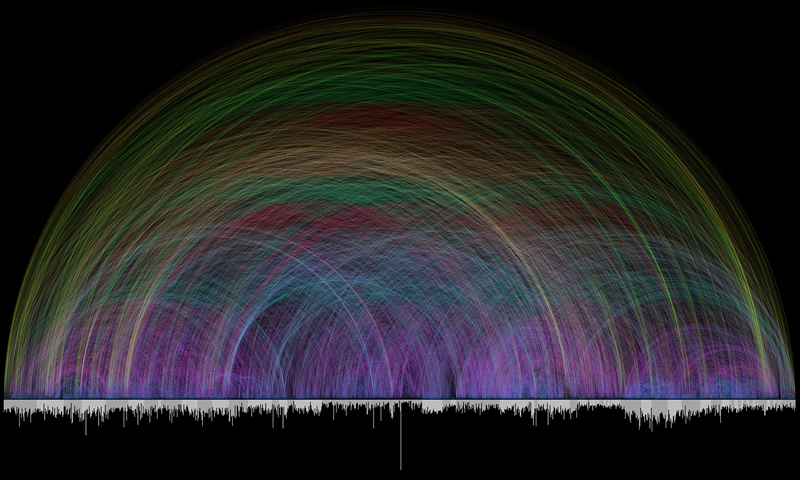
Visualizing the Bible
by way of flavorwire...
This is a really amazing set of projects by Chris Harrison on visualization (of data sets). It is amazing how information can be so beautiful...and in a way it helps us "see" the magnitude of a topic or issue.

This is a really amazing set of projects by Chris Harrison on visualization (of data sets). It is amazing how information can be so beautiful...and in a way it helps us "see" the magnitude of a topic or issue.
Tuesday, February 10, 2009
Saturday, February 07, 2009
Friday, February 06, 2009
Thursday, February 05, 2009
Michael Bierut: 26 Years, 85 Notebooks

via Kim Werker:
I never thought that I would follow so many designers but something has happened to my thinking and I think that this post from Michael Bierut goes for anyone who takes notes/makes drawings...
Kim Werker is my hero of the day after listening to her on Sister Diane's recent podcast and looking at her booklist on Amazon.com
Labels:
Arts,
Directories,
Kim,
Michael Bierut,
Military,
On the Web,
Podcast,
United States
Wednesday, February 04, 2009
via DailyDose
FILM
O, National Film Board of Canada
Hundreds of free cinema classics hit the Web
Begone Dull Care Watching brilliant films online for free is a bandwagon we're happy to hop on, and today's addition is a doozy. The National Film Board of Canada just launched a new site that offers high-quality streams of its award-winning pictures and a plethora of supporting content.
The NFB nurtures the world's best animation. The Cat Came Back (1988) is a hilarious, Oscar-nominated adaptation of the classic popular song; and Begone Dull Care (1949) is a groundbreaking experimental work, painted directly on film, that interprets the vivid sounds of the Oscar Peterson Trio.
Watch an expert's playlist. The site features picks from a host of luminaries. Director Gil Cardinal showcases aboriginal filmmaking, while the NFB's chief archivist highlights the best of the 1960s.
Kill time, not brain cells. While the archive features standard searches (genre, year, director, title, keyword), films can also be sorted by length, making it easy to fill downtime with worthy fare.
Explore the site, check out some expert playlists, and browse the NFB's online store.
- Eli Dvorkin
O, National Film Board of Canada
Hundreds of free cinema classics hit the Web
Begone Dull Care Watching brilliant films online for free is a bandwagon we're happy to hop on, and today's addition is a doozy. The National Film Board of Canada just launched a new site that offers high-quality streams of its award-winning pictures and a plethora of supporting content.
The NFB nurtures the world's best animation. The Cat Came Back (1988) is a hilarious, Oscar-nominated adaptation of the classic popular song; and Begone Dull Care (1949) is a groundbreaking experimental work, painted directly on film, that interprets the vivid sounds of the Oscar Peterson Trio.
Watch an expert's playlist. The site features picks from a host of luminaries. Director Gil Cardinal showcases aboriginal filmmaking, while the NFB's chief archivist highlights the best of the 1960s.
Kill time, not brain cells. While the archive features standard searches (genre, year, director, title, keyword), films can also be sorted by length, making it easy to fill downtime with worthy fare.
Explore the site, check out some expert playlists, and browse the NFB's online store.
- Eli Dvorkin
Tuesday, February 03, 2009
Wowee!
japan - fujimori’s architecture and ROJO
venue: pavilion at giardini
commissioner: fujimori terunobu
deputy commissioners: okabe miki, omori hiroshi
two art movements have recently gained a lot of attention in japan
- the architecture of terunobu fujimori and ROJO (on the roadway).

‘nira house’ - leek house by terunobu fujimori and nobumichi ohshima, 1997
The only "leek-y" roof that you will find equally beautiful and useful:


‘ichiya-tei’ - one-night teahouse by terunobu fujimori
and nobumichi ohshima, 2003

model ‘takasugi-an’ by terunobu fujimori, 2006
venue: pavilion at giardini
commissioner: fujimori terunobu
deputy commissioners: okabe miki, omori hiroshi
two art movements have recently gained a lot of attention in japan
- the architecture of terunobu fujimori and ROJO (on the roadway).

‘nira house’ - leek house by terunobu fujimori and nobumichi ohshima, 1997
The only "leek-y" roof that you will find equally beautiful and useful:


‘ichiya-tei’ - one-night teahouse by terunobu fujimori
and nobumichi ohshima, 2003

model ‘takasugi-an’ by terunobu fujimori, 2006
Labels:
Art movement,
Asia,
Guides and Directories,
Japan,
Maps and Views,
Seattle,
Society and Culture,
Tokyo
Subscribe to:
Posts (Atom)
![Reblog this post [with Zemanta]](http://img.zemanta.com/reblog_e.png?x-id=041dd1b5-9355-4222-b54a-10efbeb2ddb0)
![Reblog this post [with Zemanta]](http://img.zemanta.com/reblog_e.png?x-id=13ae039a-c79c-4d7c-928d-7d26e7fc3ad6)

![Reblog this post [with Zemanta]](http://img.zemanta.com/reblog_e.png?x-id=54b6fc3c-e430-4be2-8cbe-faa9424d8987)
![Reblog this post [with Zemanta]](http://img.zemanta.com/reblog_e.png?x-id=6a9a5501-f7be-4bff-8f9d-9ea16069f933)
![Reblog this post [with Zemanta]](http://img.zemanta.com/reblog_e.png?x-id=3db98b15-9e9b-4925-aade-e656cb0c73a8)
![Reblog this post [with Zemanta]](http://img.zemanta.com/reblog_e.png?x-id=dc18c02c-653d-4afd-9fd3-ad12ecb0a754)
![Reblog this post [with Zemanta]](http://img.zemanta.com/reblog_e.png?x-id=e815378b-cc9d-4b3c-8452-499d042766e8)


![Reblog this post [with Zemanta]](http://img.zemanta.com/reblog_e.png?x-id=33c42a26-c034-487e-a30f-7572ee16d663)

![Reblog this post [with Zemanta]](http://img.zemanta.com/reblog_e.png?x-id=ad90da4e-358b-41b8-a248-63362a34f3ff)