
These are so cool and so beautiful.
This is a visualization of the frequency of the words 'iran' and 'iraq' in New York Times articles since 1981.
This visualization reads like a clock. You can see the Iran Contra Affair at about 2:30. The first gulf war is at about 4pm. The second Iraq invasion is the biggest spike starting at about 9:30, continuing up until the current day (midnight).
Interestingy, Iran (in red) shows a large increase in activity in the months leading up to the end of 2008.
Built in Processing (http://www.processing.org)

This is a visualization of the frequency of the words 'hope' and 'crisis' in the New York Times, between 1981 and 2009.
The visualization reads like a clock, where 12pm is 1981 and 12 midnight is January 1, 2009.
Interestingly, the word 'crisis' has surpassed 'hope' on only a handful of occasions. Most cleary, in August of 1990 in April of 1999, and most clearly and substantially - right now.These visualizations show the top organizations and personalities for every year from 1985 to 2001. Connections between these people & organizations are indicated by lines.
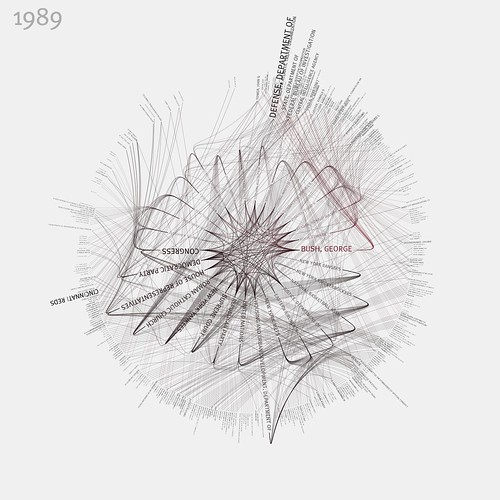
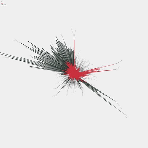
These visualizations show the top organizations and personalities for every year from 1985 to 2001. Connections between these people & organizations are indicated by lines.Data is from the newly-released NYTimes Article Search API: developer.nytimes.com
For more information, and source code to access the NYTimes API, visit
Archival-quality giclée prints of individual years are available at link
Built with Processing v1.0 - www.processing.org


No comments:
Post a Comment